pacman::p_load(tidyverse, ggridges, ggdist, ggstatsplot, patchwork)Take-home Exercise 2: Prototyping Modules for Shiny Application
1 Introduction
Financial technology (fintech) has become a critical driver of financial inclusion and digital transformation in emerging markets. However, despite this trend, publicly available datasets integrating real transactional behavior, product usage, customer satisfaction, and digital engagement remain hard-to-find.
The COFINFAD (Colombian Fintech Financial Analytics Dataset) addresses this gap by providing a comprehensive 12-month dataset (January - December 2023) covering the complete active customer base of a Colombian fintech company (48,723 customers) and over 3.1 million transaction records.
1.1 Purpose of the EDA Module
The objective of this Exploratory Data Analysis (EDA) module is to uncover behavioral, demographic, and engagement patterns that may influence:
Product adoption & App engagement
Satisfaction and Net Promoter Score (NPS)
Transactions Pattern & Value
Customer lifetime value (CLV)
1.2 Analytical Questions For The Module
The EDA module is structured to address the following key questions:
How are customers distributed across demographic and income segments?
What is the relationship between digital engagement (app logins, feature diversity) and customer loyalty metrics (CLV, NPS)?
Are satisfaction and NPS aligned with behavioral indicators such as transaction volume and active products?
2 Getting started
2.1 Installing and loading the required libraries
The R packages used in this take-home exercise are:
tidyverse (i.e. readxl, tidyr, dplyr, ggplot2) for performing data science tasks such as importing, tidying, and wrangling data, as well as creating graphics;
ggthemes: to use additional themes for ggplot2
ggridges for creating ridgeline plots;
ggdist for visualising distributions and uncertainty;
ggstatsplot: to create graphics with details from statistical tests; and
patchwork: to prepare composite figure created using ggplot2.
2.2 Importing data
In this exercise, we will use the The COFINFAD dataset. It is organized into two relational CSV files:
customer_data.csv: Contains 54 customer-level attributes including demographics, product holdings, satisfaction metrics, and aggregated behavioral features (one row per customer; 48,723 rows).
transactions_data.csv: Contains transaction records over the 12-month period (3,159,157 rows), linked via
customer_id.
In the code chunk below, read_csv() is used to import the two CSV files.
customer_data <- read_csv("data/customer_data.csv")
transactions_data <- read_csv("data/transactions_data.csv")
glimpse() will be used to check the structure of the data.
glimpse(customer_data)Rows: 48,723
Columns: 54
$ customer_id <dbl> 93716481, 49020929, 52690950, 23199751, 619…
$ age <dbl> 44, 44, 45, 45, 44, 45, 44, 44, 45, 44, 44,…
$ gender <chr> "Male", "Male", "Male", "Male", "Female", "…
$ location <chr> "Pereira, Risaralda", "Cali, Valle del Cauc…
$ income_bracket <chr> "Very High", "Medium", "High", "High", "Med…
$ occupation <chr> "Engineer", "Construction Worker", "Constru…
$ education_level <chr> "Master", "Bachelor", "Bachelor", "High Sch…
$ marital_status <chr> "Married", "Married", "Married", "Single", …
$ household_size <dbl> 5, 2, 4, 2, 3, 4, 4, 3, 1, 3, 5, 3, 3, 7, 3…
$ acquisition_channel <chr> "Partnership", "Paid Ad", "Paid Ad", "Refer…
$ customer_segment <chr> "occasional", "regular", "inactive", "inact…
$ savings_account <lgl> TRUE, TRUE, TRUE, TRUE, TRUE, TRUE, TRUE, T…
$ credit_card <lgl> TRUE, FALSE, FALSE, FALSE, TRUE, TRUE, TRUE…
$ personal_loan <lgl> FALSE, FALSE, FALSE, FALSE, FALSE, FALSE, F…
$ investment_account <lgl> FALSE, FALSE, TRUE, TRUE, FALSE, TRUE, FALS…
$ insurance_product <lgl> TRUE, FALSE, TRUE, FALSE, FALSE, FALSE, FAL…
$ active_products <dbl> 1, 5, 3, 2, 1, 1, 1, 4, 2, 3, 1, 5, 3, 1, 1…
$ app_logins_frequency <dbl> 15, 30, 4, 15, 19, 15, 44, 22, 7, 11, 7, 30…
$ feature_usage_diversity <dbl> 3, 0, 4, 4, 1, 4, 6, 1, 1, 6, 3, 1, 2, 1, 3…
$ bill_payment_user <lgl> FALSE, TRUE, TRUE, TRUE, FALSE, TRUE, TRUE,…
$ auto_savings_enabled <lgl> FALSE, FALSE, FALSE, FALSE, FALSE, TRUE, FA…
$ credit_utilization_ratio <dbl> 0.17871029, NA, NA, NA, 0.40360553, 0.07786…
$ international_transactions <dbl> 1, 1, 1, 1, 0, 0, 0, 0, 0, 1, 0, 0, 0, 1, 0…
$ failed_transactions <dbl> 0, 0, 0, 1, 0, 0, 1, 1, 0, 0, 1, 0, 0, 1, 0…
$ tx_count <dbl> 76, 10, 10, 23, 18, 15, 24, 45, 134, 13, 18…
$ avg_tx_value <dbl> 1679872.4, 5445810.0, 640335.0, 660180.4, 1…
$ total_tx_volume <dbl> 127670300, 54458100, 6403350, 15184150, 262…
$ first_tx <date> 2023-01-05, 2023-02-05, 2023-01-31, 2023-0…
$ last_tx <date> 2023-12-25, 2023-12-20, 2023-12-12, 2023-1…
$ base_satisfaction <dbl> 9.213372, 6.073093, 8.198643, 7.529577, 6.6…
$ tx_satisfaction <dbl> 0.380, 0.050, 0.050, 0.115, 0.090, 0.075, 0…
$ product_satisfaction <dbl> 0.6, 0.2, 0.6, 0.4, 0.4, 0.6, 0.4, 0.4, 0.6…
$ satisfaction_score <dbl> 5, 3, 4, 4, 3, 4, 4, 4, 5, 4, 4, 5, 4, 3, 4…
$ nps_score <dbl> -7, -46, -29, -31, -47, -29, -34, -36, -4, …
$ last_survey_date <date> 2023-12-16, 2023-05-05, 2023-11-16, 2023-0…
$ support_tickets_count <dbl> 1, 1, 0, 2, 2, 1, 1, 0, 2, 0, 0, 2, 3, 1, 0…
$ resolved_tickets_ratio <dbl> 0.0000000, 1.0000000, 0.0000000, 0.5000000,…
$ app_store_rating <dbl> 3.5, 4.0, 5.0, 4.5, 4.0, 4.0, 5.0, 4.5, 4.5…
$ feedback_sentiment <chr> "Neutral", "Positive", "Positive", "Positiv…
$ feature_requests <chr> "Budgeting tools", NA, NA, "Cryptocurrency …
$ complaint_topics <chr> NA, NA, NA, NA, "App performance", NA, NA, …
$ clv_segment <chr> "Gold", "Bronze", "Gold", "Bronze", "Gold",…
$ monthly_transaction_count <dbl> 1.428571, 1.571429, 2.500000, 1.555556, 2.1…
$ average_transaction_value <dbl> 6054025.0, 2127413.6, 3575915.0, 1513353.6,…
$ total_transaction_volume <dbl> 60540250, 23401550, 35759150, 21186950, 116…
$ transaction_frequency <dbl> 0.03076923, 0.03293413, 0.05000000, 0.04778…
$ last_transaction_date <date> 2023-12-05, 2023-12-18, 2023-10-27, 2023-1…
$ preferred_transaction_type <chr> "Transfer", "Transfer", "Transfer", "Transf…
$ first_transaction_date <date> 2023-01-05, 2023-02-05, 2023-01-31, 2023-0…
$ weekend_transaction_ratio <dbl> 0.30000000, 0.18181818, 0.30000000, 0.14285…
$ avg_daily_transactions <dbl> 0.03076923, 0.03293413, 0.05000000, 0.04778…
$ customer_tenure <dbl> 11.633333, 11.500000, 8.766667, 10.733333, …
$ churn_probability <dbl> 0.3622688, 0.1817896, 0.3212651, 0.3366287,…
$ customer_lifetime_value <dbl> 312414808, 167022286, 19403711, 35978105, 3…glimpse(transactions_data)Rows: 3,159,157
Columns: 4
$ customer_id <dbl> 93716481, 93716481, 93716481, 93716481, 93716481, 93716481…
$ date <date> 2023-11-23, 2023-01-05, 2023-11-05, 2023-04-14, 2023-08-0…
$ amount <dbl> 1262800, 928900, 1683100, 4507350, 2096150, 2124050, 11087…
$ type <chr> "Transfer", "Withdrawal", "Payment", "Payment", "Payment",…2.3 Data Wrangling
2.3.1 Data Type Correction
Variables are converted into appropriate data types:
Categorical variables →
factorBoolean variables →
logicalDate variables →
DateNumeric measures →
numericorinteger
customer_data <- customer_data %>%
  mutate(
    gender = as.factor(gender),
    income_bracket = as.factor(income_bracket),
    education_level = as.factor(education_level),
    marital_status = as.factor(marital_status),
    acquisition_channel = as.factor(acquisition_channel),
    customer_segment = as.factor(customer_segment),
    clv_segment = as.factor(clv_segment),
    savings_account = as.logical(savings_account),
    credit_card = as.logical(credit_card),
    personal_loan = as.logical(personal_loan),
    investment_account = as.logical(investment_account),
    insurance_product = as.logical(insurance_product),
    first_tx = as.Date(first_tx),
    last_tx = as.Date(last_tx),
    last_survey_date = as.Date(last_survey_date)
  )
transactions_data <- transactions_data %>%
mutate(
date = as.Date(date),
type = as.factor(type)
)2.3.2 Missing values inspection
customer_data %>%
  summarise(across(everything(), ~sum(is.na(.))))
# A tibble: 1 × 54
customer_id age gender location income_bracket occupation education_level
<int> <int> <int> <int> <int> <int> <int>
1 0 0 0 0 0 0 0
# ℹ 47 more variables: marital_status <int>, household_size <int>,
# acquisition_channel <int>, customer_segment <int>, savings_account <int>,
# credit_card <int>, personal_loan <int>, investment_account <int>,
# insurance_product <int>, active_products <int>, app_logins_frequency <int>,
# feature_usage_diversity <int>, bill_payment_user <int>,
# auto_savings_enabled <int>, credit_utilization_ratio <int>,
# international_transactions <int>, failed_transactions <int>, …transactions_data %>%
summarise(across(everything(), ~sum(is.na(.))))# A tibble: 1 × 4
customer_id date amount type
<int> <int> <int> <int>
1 0 0 0 02.3.3 Data Validation Checks
Basic statistical summaries using summary() are performed to confirms data reliability before proceeding to exploratory visualization.
summary(customer_data$age) Min. 1st Qu. Median Mean 3rd Qu. Max.
29.00 30.00 45.00 44.54 59.00 60.00 summary(customer_data$churn_probability) Min. 1st Qu. Median Mean 3rd Qu. Max.
0.1143 0.3029 0.3540 0.3429 0.3927 0.5006 summary(customer_data$customer_lifetime_value) Min. 1st Qu. Median Mean 3rd Qu. Max.
0.000e+00 5.841e+07 1.297e+08 3.282e+08 2.974e+08 1.777e+10 write_rds(customer_data, "data/rds/customer_data.rds")
write_rds(transactions_data, "data/rds/transactions_data.rds")3. Univariate Analysis
3.1 Demographic distributions of customer
3.1.1 Age & Gender
We will use simple ggplot() plots to have an overview of the distribution of customer’s age and gender. We group customers into different age groups for better visualization.
customer_data <- customer_data %>%
  mutate(
    age = as.integer(age),
    age_group = case_when(
      is.na(age) ~ "Unknown",
      age < 18 ~ "<18",
      age <= 25 ~ "18-25",
      age <= 35 ~ "26-35",
      age <= 45 ~ "36-45",
      age <= 55 ~ "46-55",
      age <= 65 ~ "56-65",
      TRUE ~ "65+"
    ),
    age_group = factor(
      age_group,
      levels = c("<18", "18-25", "26-35", "36-45", "46-55", "56-65", "65+", "Unknown")
    )
  )

table(customer_data$age_group, useNA = "ifany")
    <18   18-25   26-35   36-45   46-55   56-65     65+ Unknown
      0       0   16219   16139       0   16365       0       0
age_group_summary <- customer_data %>%
count(age_group) %>%
mutate(
prop = n / sum(n),
label = scales::percent(prop, accuracy = 0.1)
)
age_group_summary# A tibble: 3 × 4
age_group n prop label
<fct> <int> <dbl> <chr>
1 26-35 16219 0.333 33.3%
2 36-45 16139 0.331 33.1%
3 56-65 16365 0.336 33.6%ch1 <- ggplot(age_group_summary, aes(x = "", y = n, fill = age_group)) +
geom_col(width = 1, color = "white") +
coord_polar(theta = "y") +
geom_text(aes(label = label),
position = position_stack(vjust = 0.5),
size = 3) +
labs(
title = "Customer Age Group Distribution",
fill = "Age Group"
) +
theme_void()
ch2 <- ggplot(customer_data, aes(x = gender)) +
geom_bar(fill = "darkblue") +
labs(
title = "Distribution of Customer Gender",
x = "Gender",
y = "Number of Customers"
) +
theme_minimal()
ch1 + ch2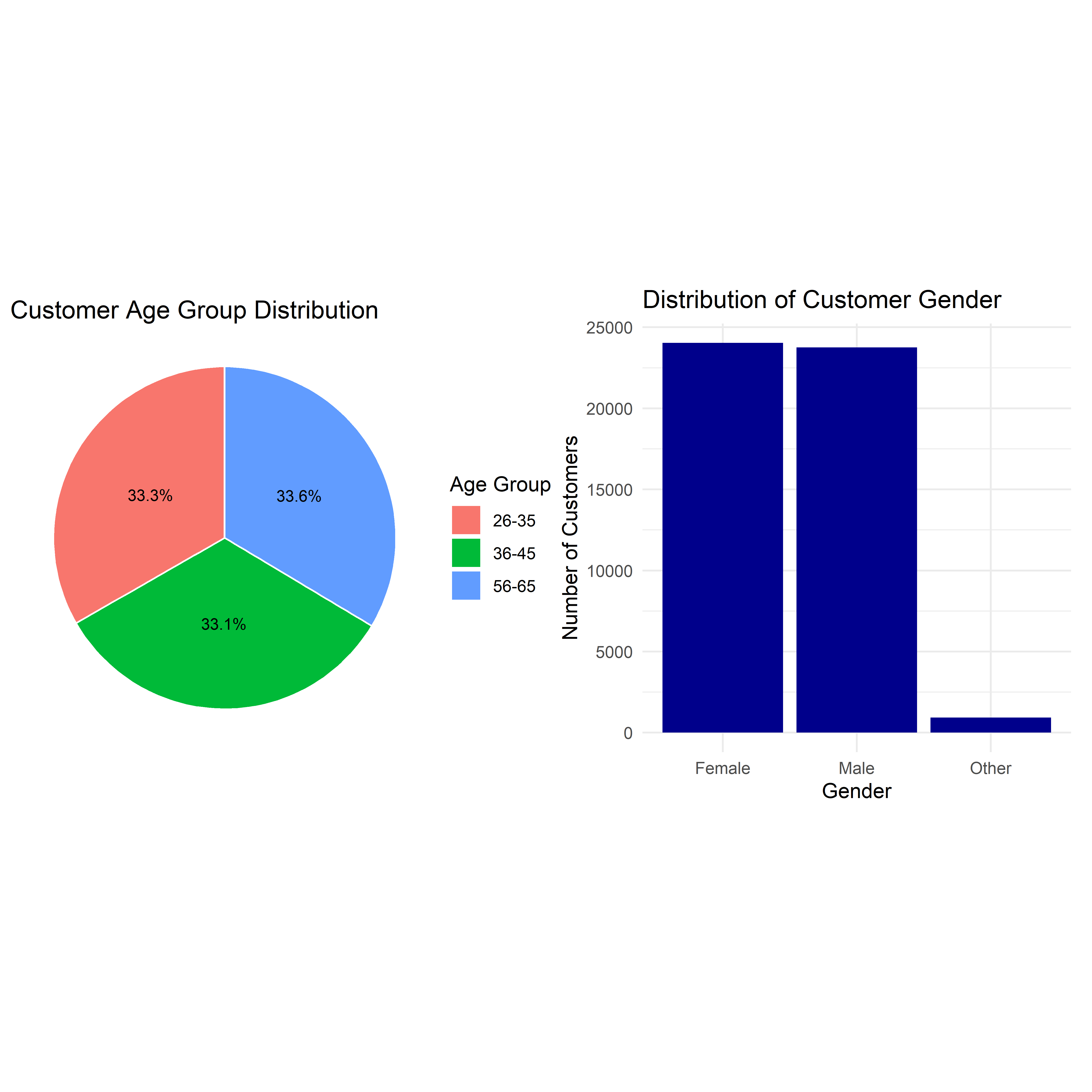
Note
The distribution between male and female is relatively even, same for the age group distribution, but the customers are only concise into 3 different groups. This suggest that the business is targeting customers in particular age groups, rather than in gender sections.
3.1.2 Income Brackets & Educational Level
ch3 <- ggplot(customer_data, aes(x = income_bracket)) +
  geom_bar(fill = "steelblue") +
  labs(
    title = "Distribution of Customer Income Brackets",
    x = "Income Bracket",
    y = "Number of Customers"
  ) +
  theme_minimal()

edu_sum <- customer_data %>%
  count(education_level, sort = TRUE) %>%
  mutate(education_level = fct_inorder(education_level))

ch4 <- ggplot(edu_sum, aes(x = n, y = education_level)) +
  geom_segment(aes(x = 0, xend = n, yend = education_level), linewidth = 2) +
  geom_point(size = 3) +
  labs(
    title = "Educational Level Distribution",
    x = "# of Customers",
    y = "Edu Lvl"
  ) +
  theme_minimal()

ch3 + ch4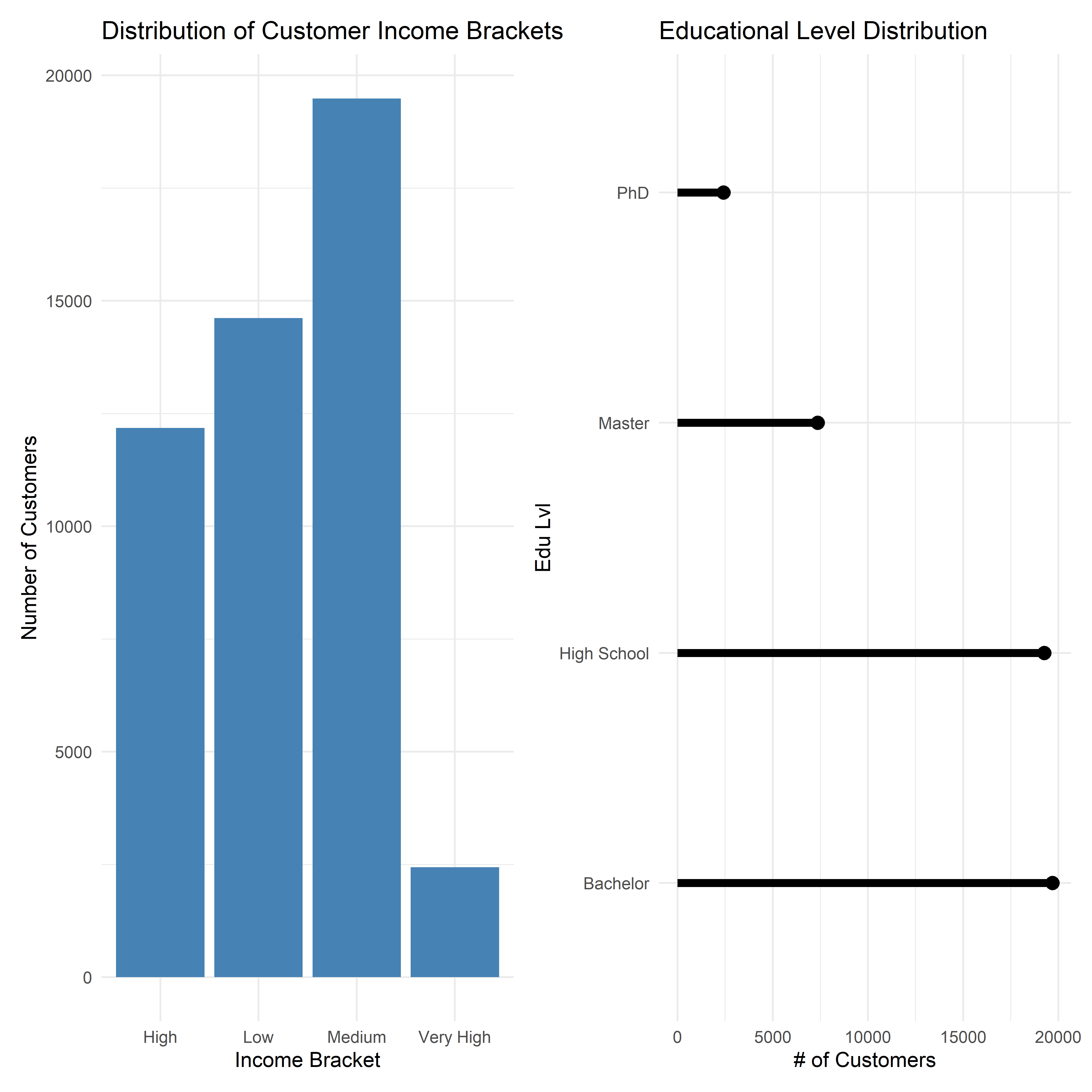
Note
The majority of customers fall within the low to medium income segment, only a small proportion belong to the very high category. On the other hand, most customers have either a Bachelor’s degree or a High School qualification, while significantly fewer Master’s or PhD degrees. This pattern may reflect that the service is accessible to the broader population rather than exclusively high-net-worth users.
3.2 Customer Engagement Behaviour
Customer engagement is an important indicator of platform activity and potential retention. We will use ggplot() to have a look at several indicators.
3.2.1 App Login Frequency Distribution
ggplot(customer_data, aes(x = app_logins_frequency)) +
  stat_halfeye(
    adjust = .7,
    width = .6,
    fill = "darkgreen"
  ) +
  labs(
    title = "Distribution of Monthly App Login Frequency",
    x = "Monthly App Logins",
    y = NULL
  ) +
  theme_minimal()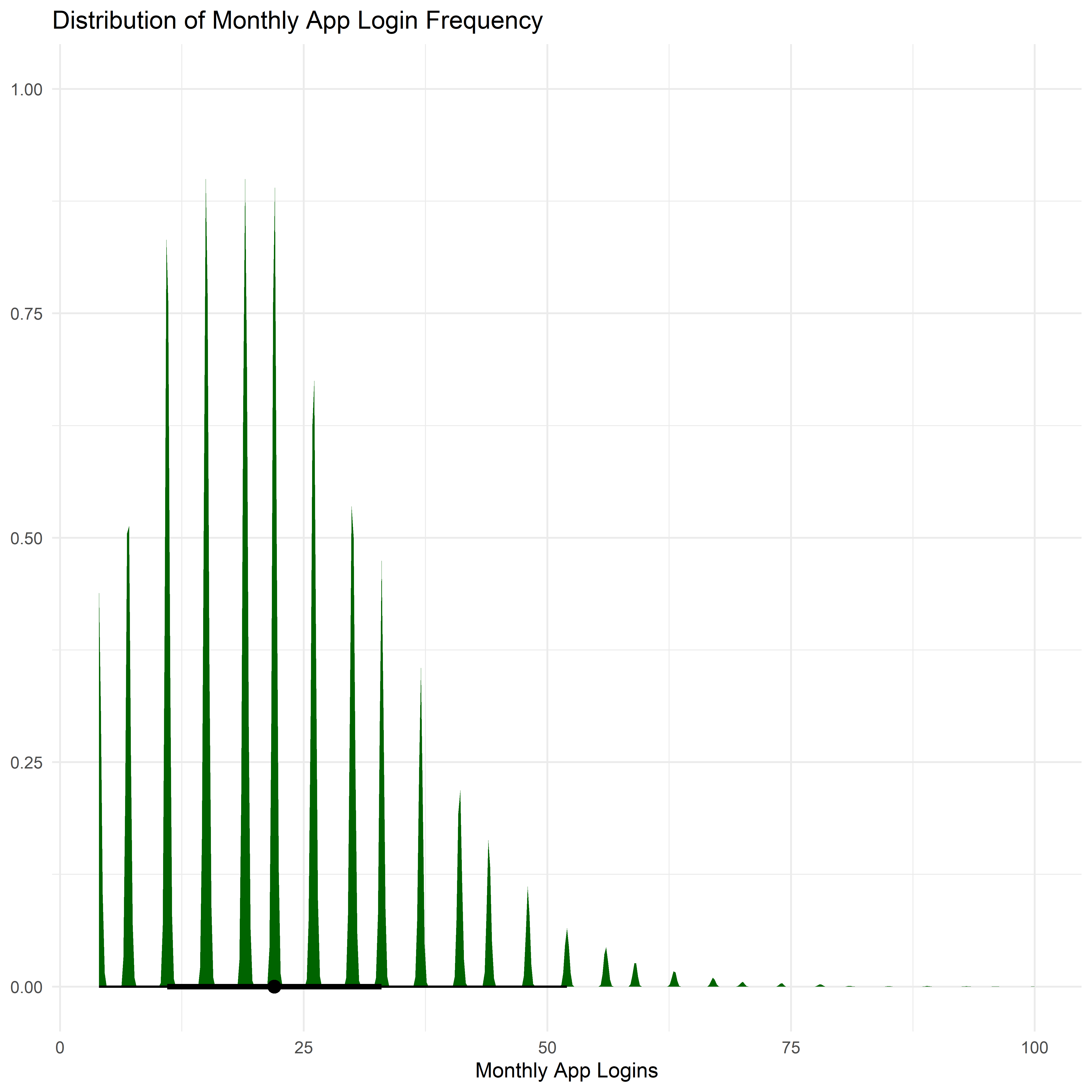
Note
The majority of customers access the application between 10 and 30 times per month, reflecting regular engagement with the platform. The right-skewed distribution suggests the presence of a smaller group of highly active users who log in significantly more frequently, potentially representing customers with higher financial activity.
3.2.2 Satisfaction Score Distribution
customer_data <- customer_data %>%
  mutate(
    satisfaction_score = factor(
      satisfaction_score,
      levels = c(1,2,3,4,5,6),
      labels = c(
        "1",
        "2",
        "3",
        "4",
        "5",
        "6"
      )
    )
  )
satisfaction_summary <- customer_data %>%
  count(satisfaction_score) %>%
  mutate(prop = n / sum(n))
ggplot(satisfaction_summary,
       aes(x = "", y = prop, fill = satisfaction_score)) +
  geom_col(width = 0.7) +
  scale_fill_brewer(palette = "RdYlGn") +
  scale_y_continuous(labels = scales::percent) +
  labs(
    title = "Customer Satisfaction Distribution",
    x = NULL,
    y = "Percentage of Customers",
    fill = "Satisfaction Level"
  ) +
  theme_minimal()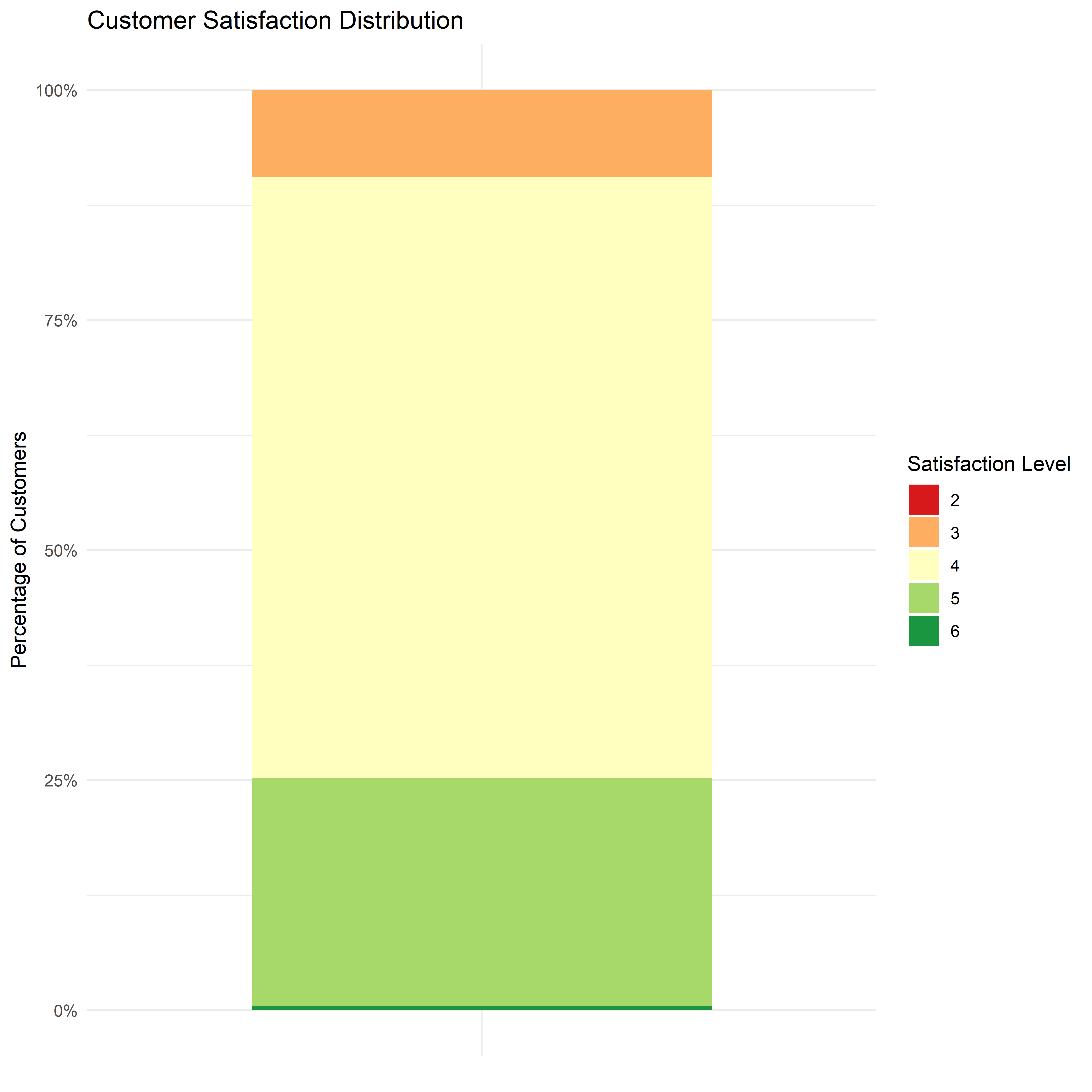
Note
The majority of customers report satisfaction scores in higher categories, particularly 4 and 5. Very few respondents fall into the lower satisfaction levels, suggesting generally positive customer sentiment toward the platform.
3.2.3 CLV Distribution
customer_data <- customer_data %>%
  mutate(clv_usd = customer_lifetime_value / 4000)
ggplot(customer_data, aes(x = clv_usd)) +
  geom_density(fill = "purple", alpha = 0.7) +
  scale_x_continuous(labels = scales::label_dollar()) +
  labs(
    title = "Distribution of Customer Lifetime Value",
    x = "Customer Lifetime Value (USD)",
    y = "Density"
  ) +
  theme_minimal()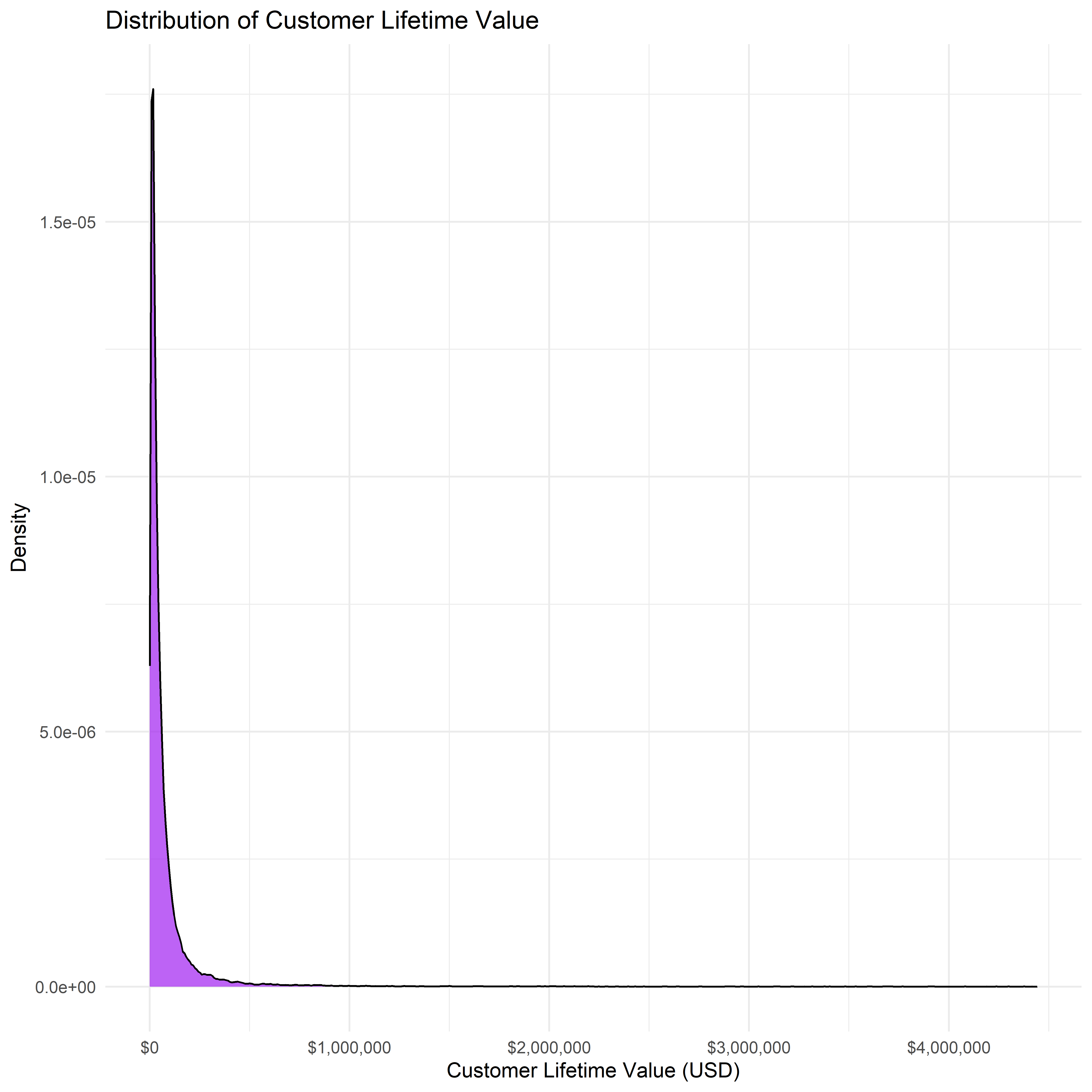
Note
The CLV distribution is heavily right-skewed, indicating that while most customers generate relatively low lifetime value, a small proportion of customers contribute disproportionately high value. Align with the Demographic findings above, this CLV pattern suggest that the platform did not generate revenue from the low-to-middle majority of customers, and it is not the main focus of the platform.
Churn Probability Distribution
ggplot(customer_data, aes(x = churn_probability)) +
  geom_density(fill = "red", alpha = 0.6) +
  labs(
    title = "Distribution of Customer Churn Probability",
    x = "Churn Probability",
    y = "Density"
  ) +
  theme_minimal()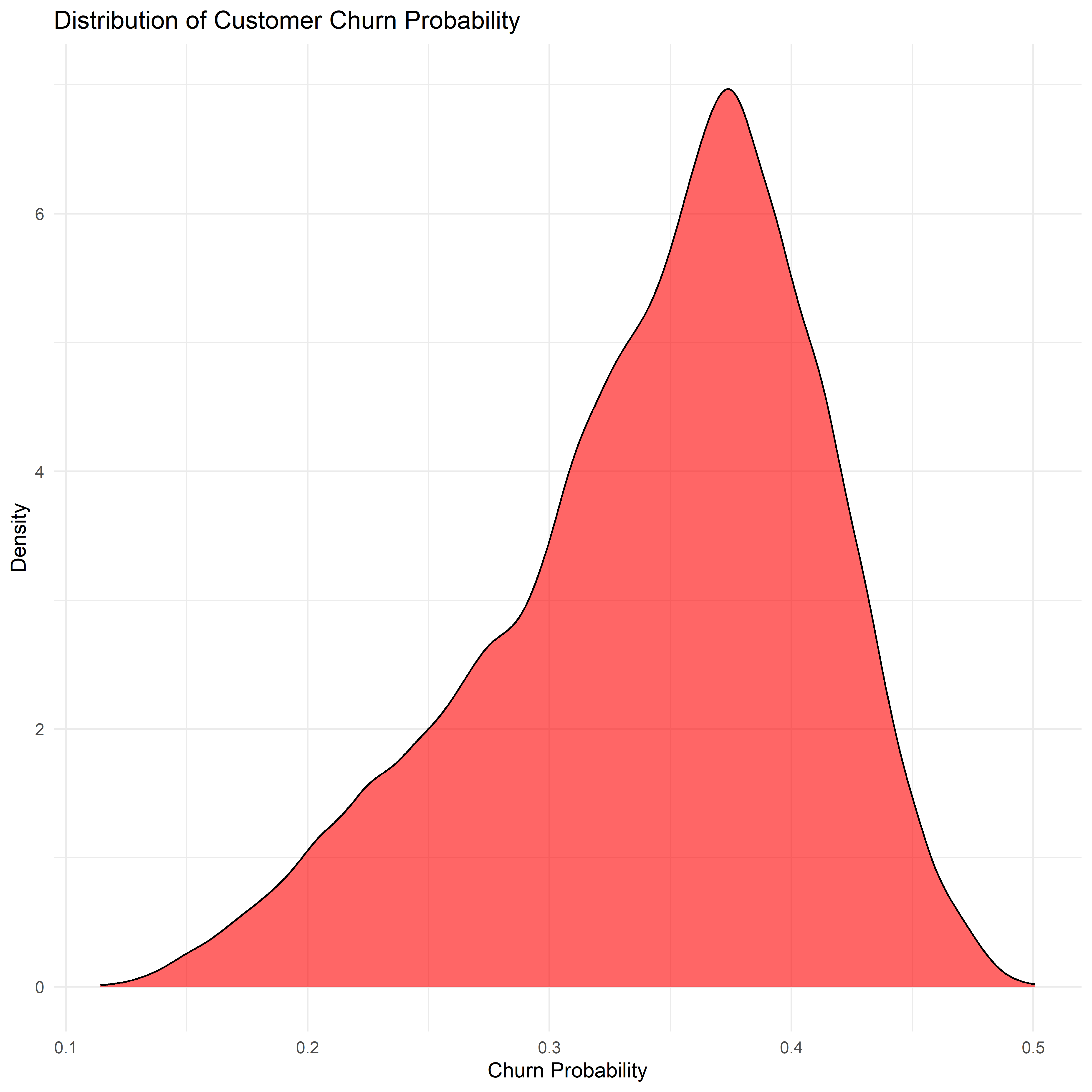
Note
Most customers have a predicted churn risk between 0.30 and 0.40, and fall into a moderate churn risk category. Very few customers exhibit extremely low or extremely high churn probabilities, suggesting that the overall customer base demonstrates relatively balanced retention risk levels.
Product ownership distribution
prod_long <- customer_data %>%
  select(savings_account, credit_card, personal_loan, investment_account, insurance_product) %>%
  pivot_longer(everything(), names_to = "product", values_to = "has_product") %>%
  mutate(
    has_product = if_else(has_product, "Yes", "No"),
    product = str_replace_all(product, "_", " ") %>% str_to_title()
  ) %>%
  count(product, has_product) %>%
  group_by(product) %>%
  mutate(prop = n / sum(n)) %>%
  ungroup()

ggplot(prod_long, aes(x = product, y = prop, fill = has_product)) +
  geom_col(position = "fill") +
  coord_flip() +
  scale_y_continuous(labels = scales::percent) +
  labs(
    title = "Product Ownership Rate by Product",
    x = NULL,
    y = "Share of Customers",
    fill = "Owns Product"
  ) +
  theme_minimal()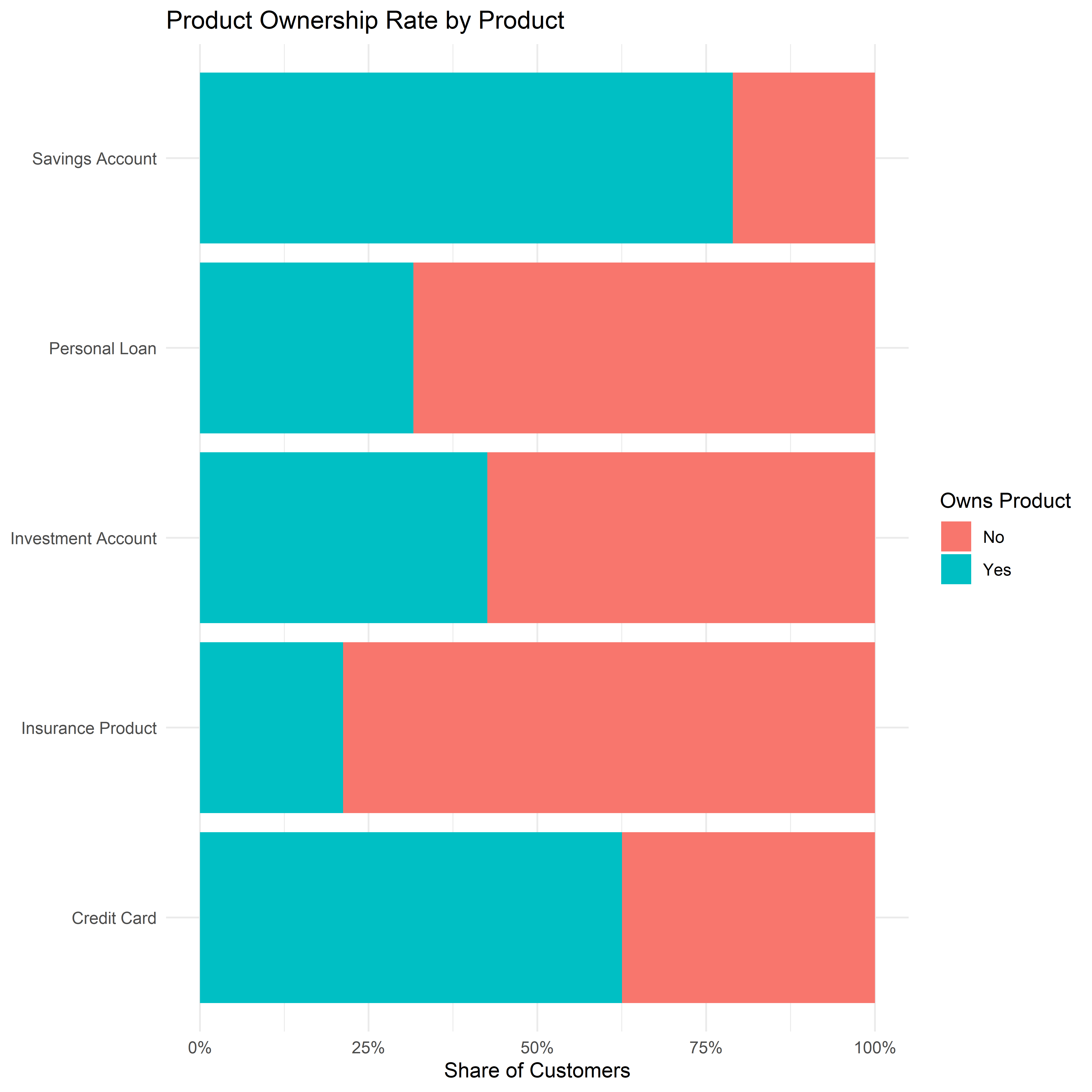
Note
Savings Account and Credit Card are the main forces of the platform with ownership rates more than half, while the other products saw less than 50% ownership.
NPS distribution
ggplot(customer_data, aes(x = nps_score)) +
  geom_density(fill = "lightgreen", alpha = 0.6) +
  labs(
    title = "NPS Score Distribution",
    x = "NPS Score",
    y = "Density"
  ) +
  theme_minimal()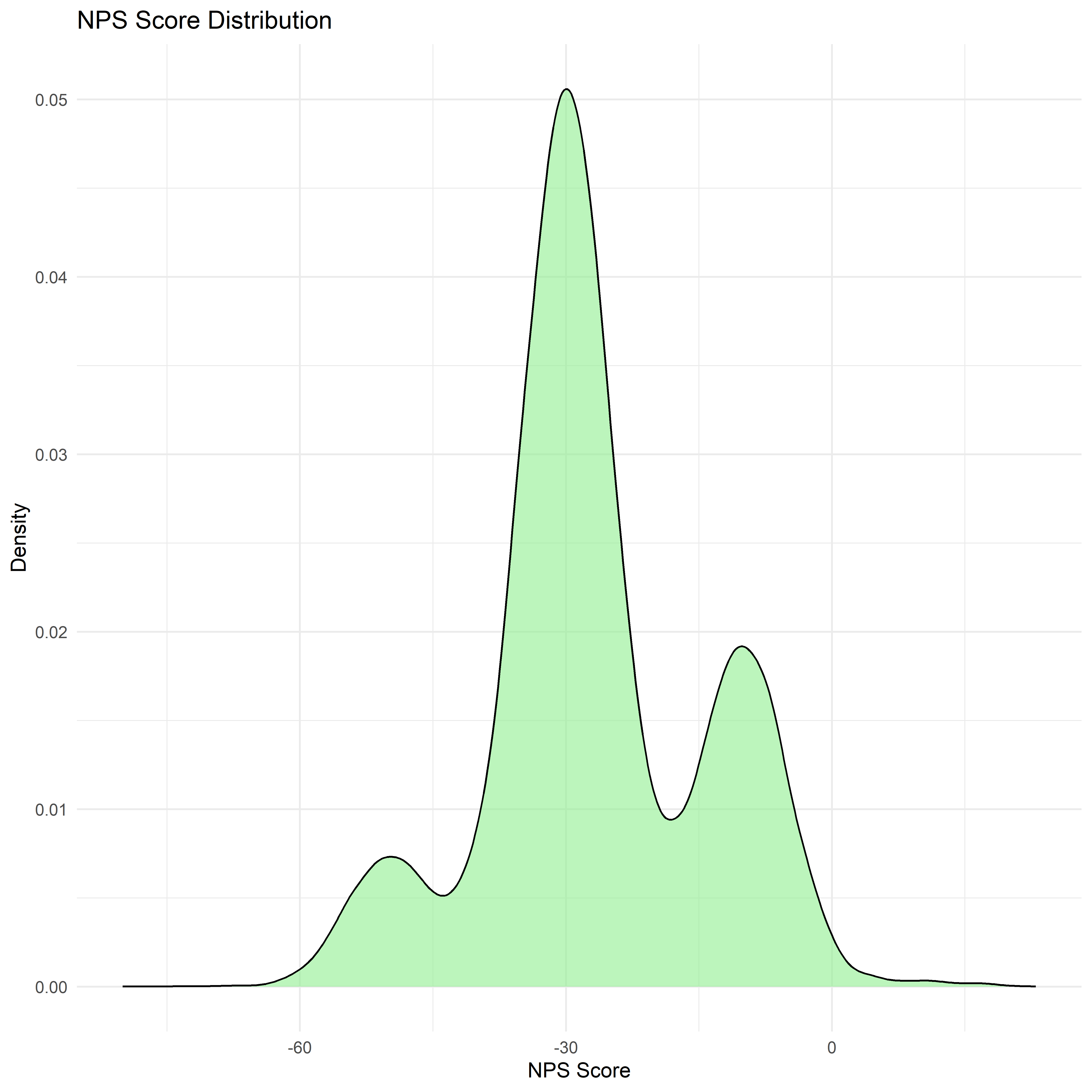
Note
Net Promoter Score (NPS) is concentrated in the negative range, with most values clustering around approximately -30 to -10. This indicates that a larger proportion of customers are categorized as detractors, suggesting relatively low customer advocacy for the platform.
4. Bivariate / Multivariate Analysis
While univariate analysis provides insights into the distribution of individual variables, bivariate and multivariate analysis helps uncover relationships between customer characteristics, engagement behaviour, and financial outcomes. This section explores how different customer attributes interact with key performance indicators such as CLV, satisfaction, engagement, and churn probability.
4.1 App Login Frequency vs Churn Probability
ggplot(customer_data, aes(x = app_logins_frequency, y = churn_probability)) +
  geom_point(alpha = 0.3, color = "steelblue") +
  geom_smooth(method = "loess", color = "red") +
  labs(
    title = "App Login Frequency vs. Churn Probability",
    x = "Monthly App Login Frequency",
    y = "Churn Probability"
  ) +
  theme_minimal()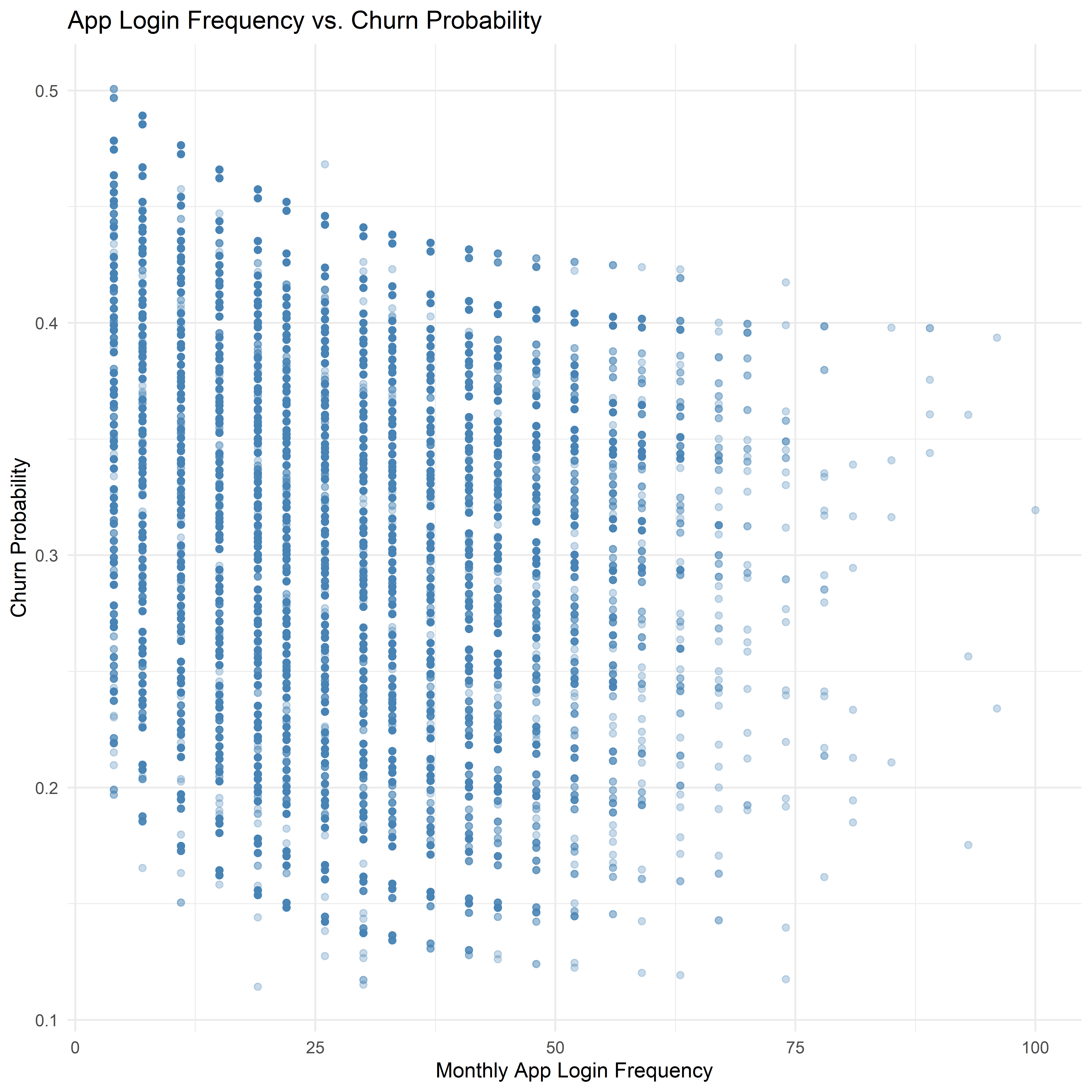
Note
The scatter plot suggests a slight negative relationship between monthly app login frequency and churn probability. Customers who log into the application more frequently tend to exhibit lower predicted churn probabilities, while customers with lower login frequency show a wider range of churn risk. This pattern indicates that higher engagement with the platform may be associated with improved customer retention.
4.2 Transaction Frequency vs Satisfaction Score
tx_sat_summary <- customer_data %>%
  group_by(satisfaction_score) %>%
  summarise(
    avg_tx = mean(transaction_frequency, na.rm = TRUE)
  )

ggplot(tx_sat_summary,
       aes(x = avg_tx,
           y = factor(satisfaction_score),
           fill = factor(satisfaction_score))) +
  geom_col() +
  scale_fill_brewer(palette = "RdYlGn") +
  labs(
    title = "Average Transaction Frequency by Satisfaction Score",
    x = "Average Transaction Frequency",
    y = "Satisfaction Score",
    fill = "Satisfaction Level"
  ) +
  theme_minimal()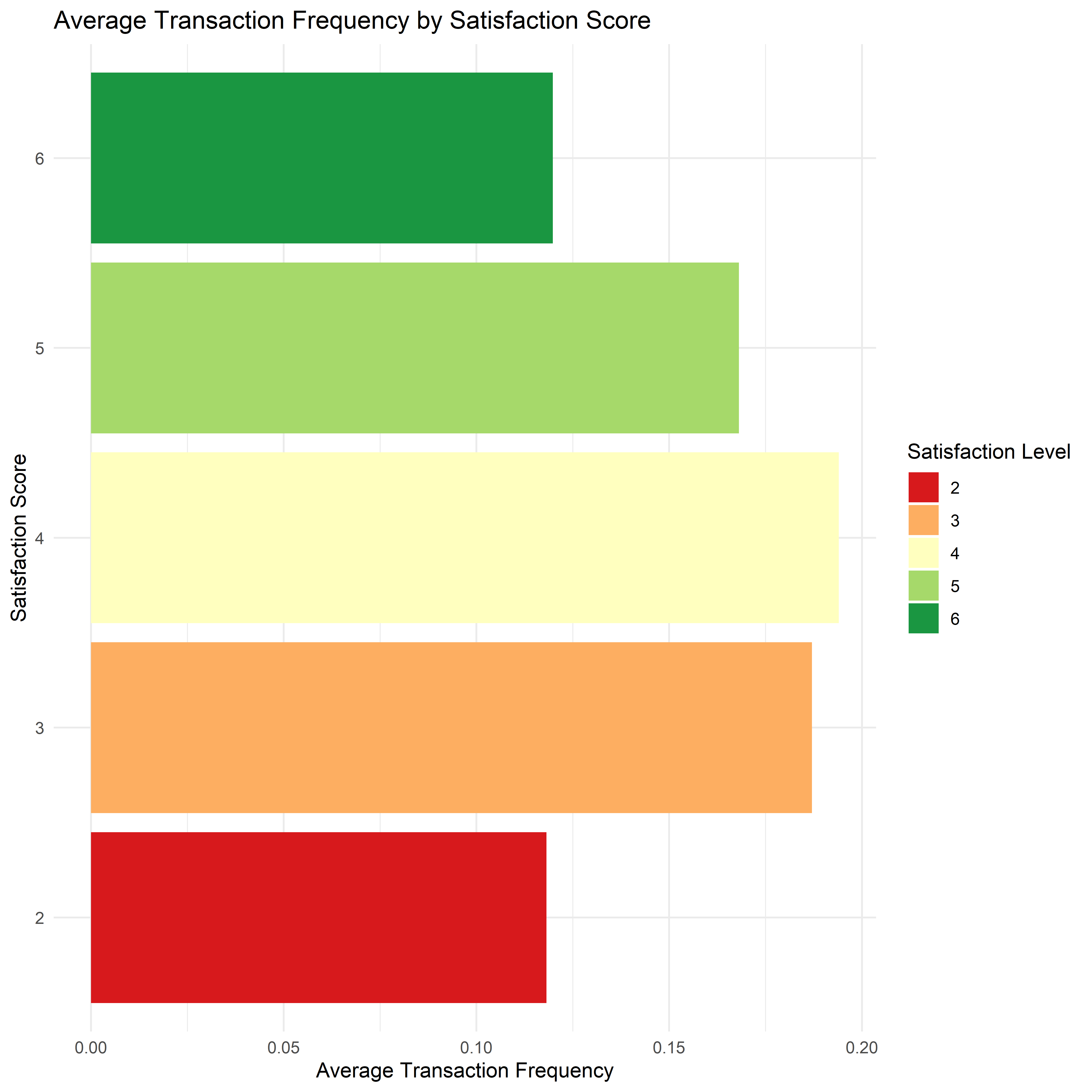
Note
Transaction activity peaks around satisfaction level 4, suggesting that customers who are reasonably satisfied with the platform tend to engage more frequently in transactions. In contrast, customers with lower satisfaction scores demonstrate lower transaction frequency, indicating weaker engagement with the platform.
4.3 App Logins vs NPS Score
ggplot(customer_data, aes(x = app_logins_frequency, y = nps_score)) +
  geom_jitter(alpha = 0.3, color = "purple") +
  geom_smooth(method = "loess", color = "black") +
  labs(
    title = "App Engagement and Net Promoter Score",
    x = "Monthly App Login Frequency",
    y = "NPS Score"
  ) +
  theme_minimal()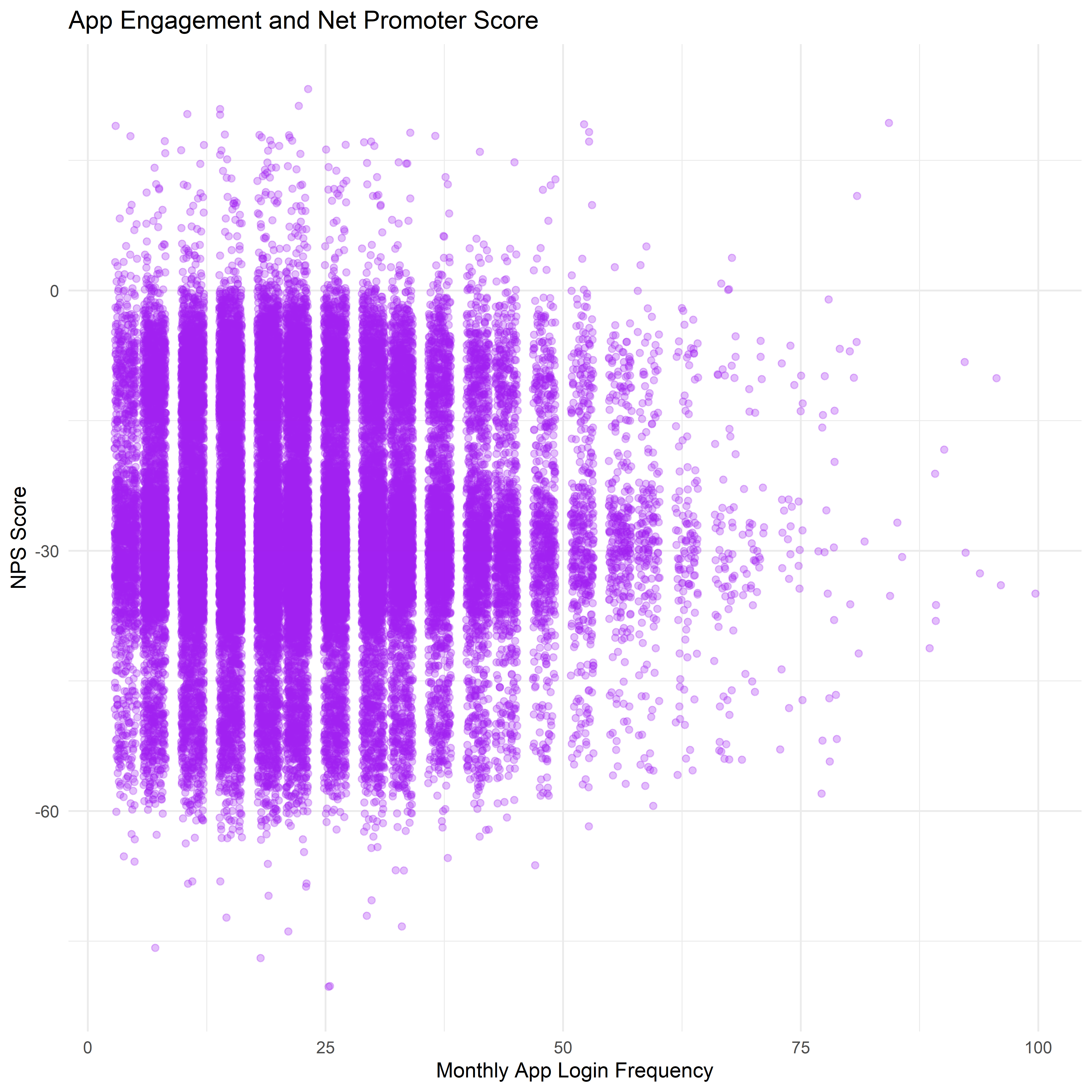
Note
The relationship between monthly app login frequency and Net Promoter Score (NPS) appears relatively weak, with NPS values remaining largely negative across different levels of app engagement. While customers with higher login frequency show slightly greater variability in NPS scores, the overall distribution suggests that increased app usage does not strongly correspond to higher customer advocacy.
5. Transaction Behavior
By analyzing transaction patterns over time and across different transaction types, we can better understand user activity levels and behavioral trends.
This section explores key aspects of transaction behavior including transaction volume distribution, transaction type composition, and transaction patterns.
5.1 Density Plot of Transaction Amount
transactions_data <- transactions_data %>%
  mutate(amount_usd = amount / 4000)
ggplot(transactions_data, aes(x = amount_usd)) +
  geom_density(fill = "steelblue", alpha = 0.7) +
  labs(
    title = "Distribution of Transaction Amounts in US Dollars",
    x = "Transaction Amount (USD)",
    y = "Density"
  ) +
  theme_minimal()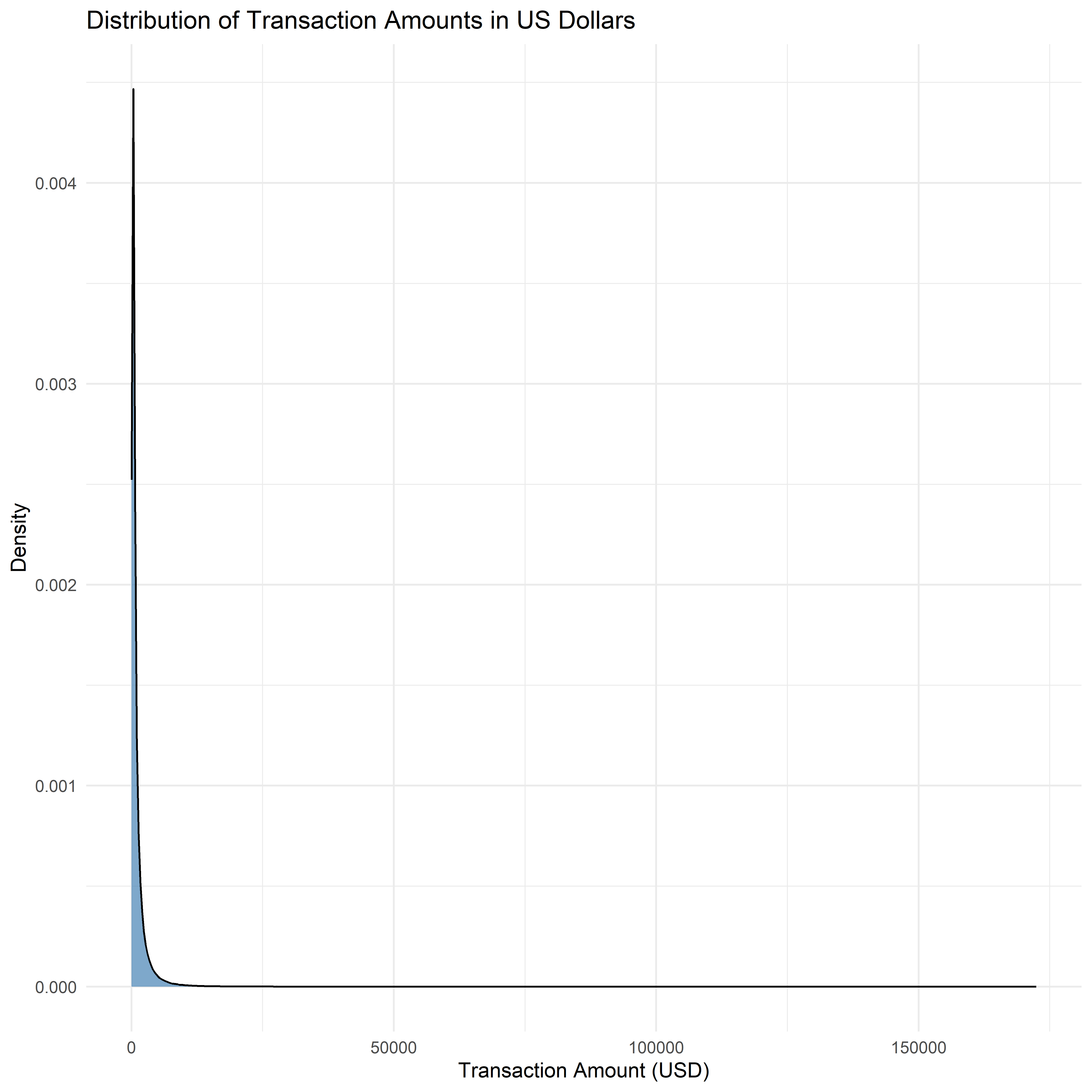
Note
The distribution of transaction amounts is highly right-skewed, indicating that most transactions involve relatively small amounts, while a smaller number of transactions are significantly larger in value. This pattern is typical in financial transaction data, where everyday payments dominate transaction counts, while large-value transactions occur less frequently.
5.2 Transaction Types Distribution
tx_type_summary <- transactions_data %>%
  count(type)

ggplot(tx_type_summary, aes(x = reorder(type, n), y = n, fill = type)) +
  geom_col() +
  coord_flip() +
  labs(
    title = "Transaction Type Distribution",
    x = "Transaction Type",
    y = "Number of Transactions"
  ) +
  theme_minimal() +
  theme(legend.position = "none")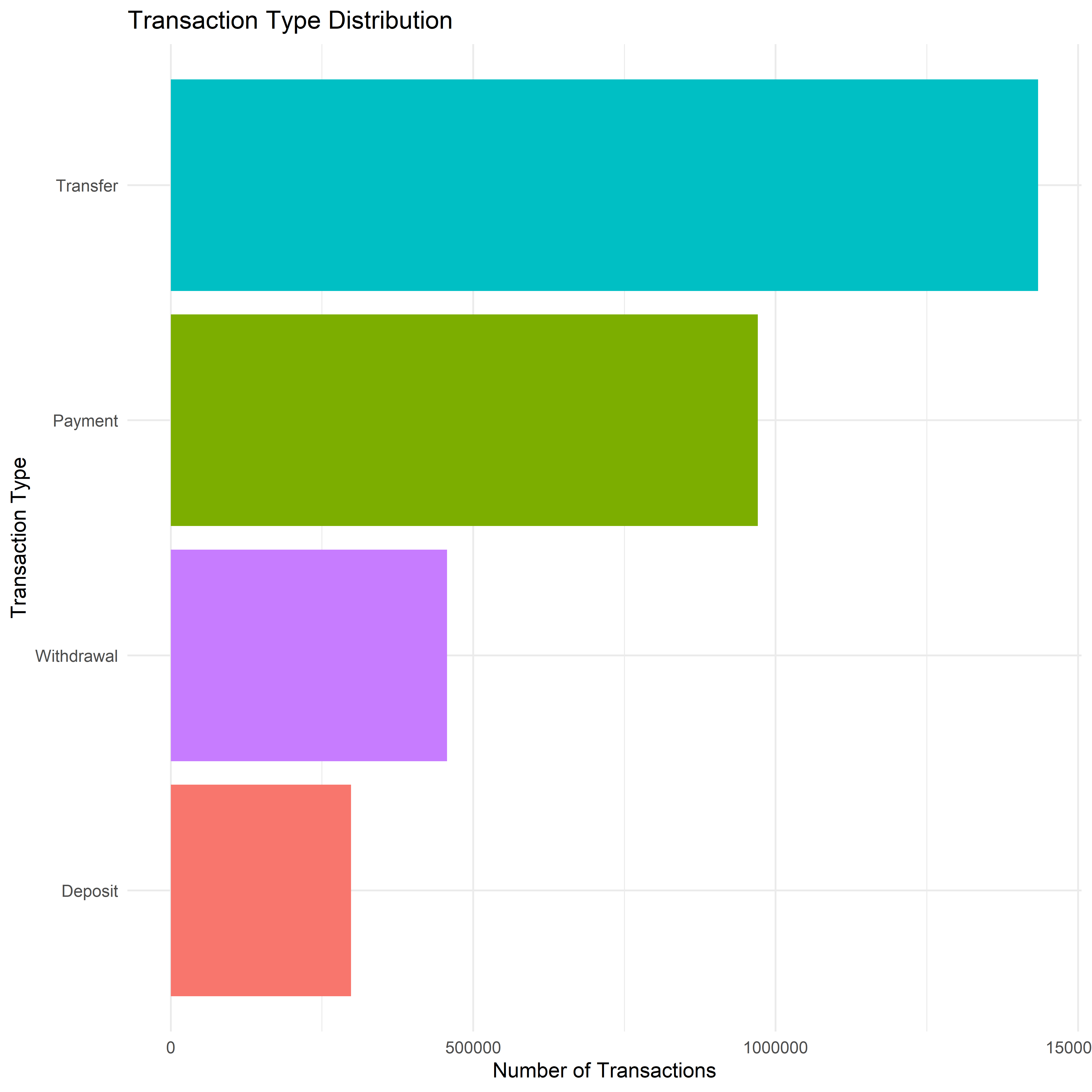
Note
Transfer and Payment activities are most commonly performed by customers, indicating those are core functions that customers rely on regularly.
5.3 Transaction Activity Over Time
Examining transaction patterns over time can reveal customer activity cycles.
daily_tx <- transactions_data %>%
  group_by(date) %>%
  summarise(tx_count = n())

ggplot(daily_tx, aes(x = date, y = tx_count)) +
  geom_line(color = "darkgreen") +
  labs(
    title = "Daily Transaction Volume",
    x = "Date",
    y = "Number of Transactions"
  ) +
  theme_minimal()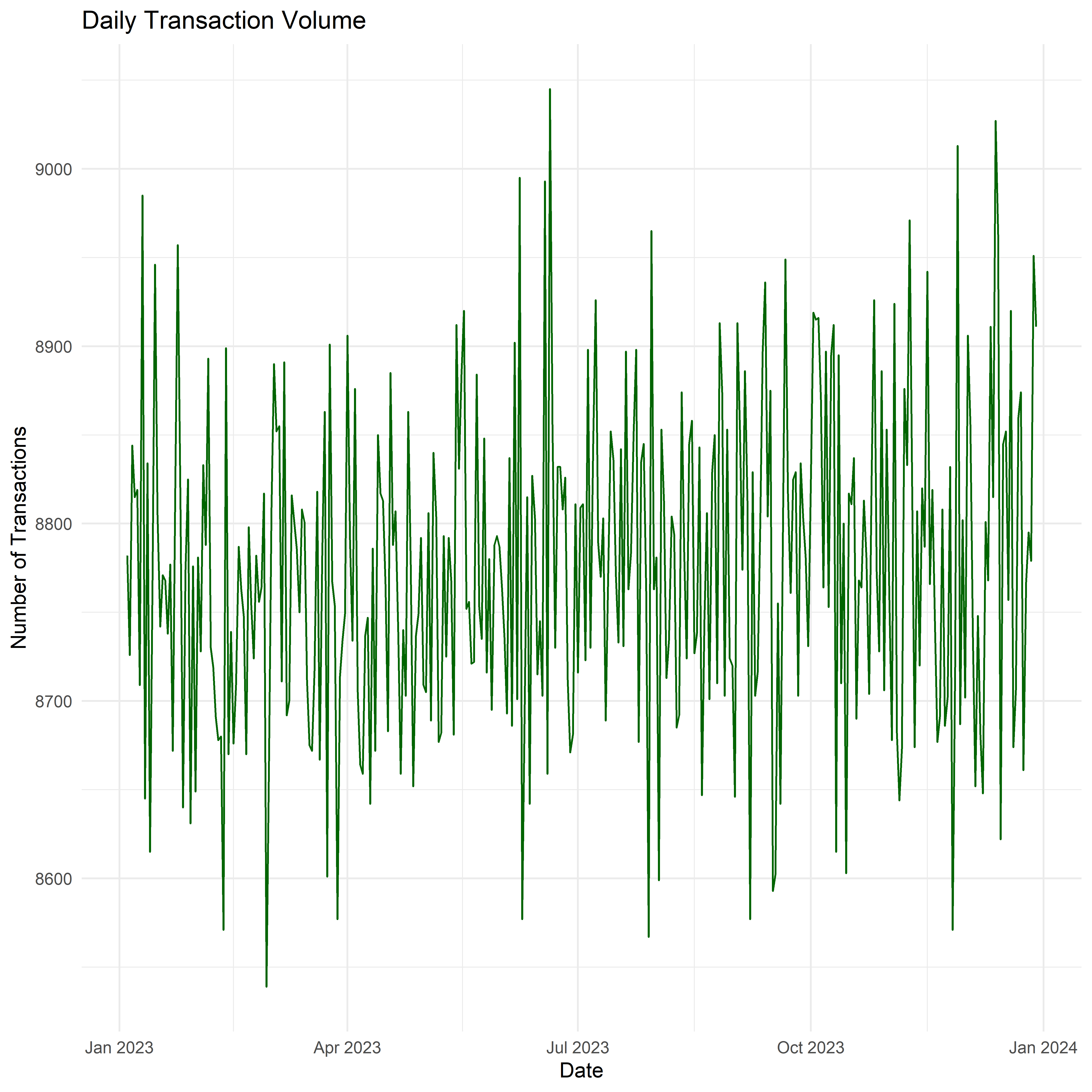
Note
The daily transaction volume remains relatively stable throughout the year, with the number of transactions generally fluctuating between approximately 8,600 and 9,000 transactions per day.
Higher number of transactions can be observed during January, June, July and December, suggest these are festive months in the year, which lead to higher transaction activities.
5.4 Weekend vs Weekday Transaction Activity
transactions_data <- transactions_data %>%
  mutate(
    weekday = weekdays(date)
  )
transactions_data <- transactions_data %>%
  mutate(
    day_type = ifelse(weekday %in% c("Saturday","Sunday"),
                      "Weekend",
                      "Weekday")
  )

tx_daytype <- transactions_data %>%
  group_by(day_type) %>%
  summarise(tx_count = n())

ggplot(tx_daytype, aes(x = day_type, y = tx_count, fill = day_type)) +
  geom_col() +
  labs(
    title = "Weekend vs Weekday Transactions",
    x = "Day Type",
    y = "Number of Transactions"
  ) +
  theme_minimal() +
  theme(legend.position = "none")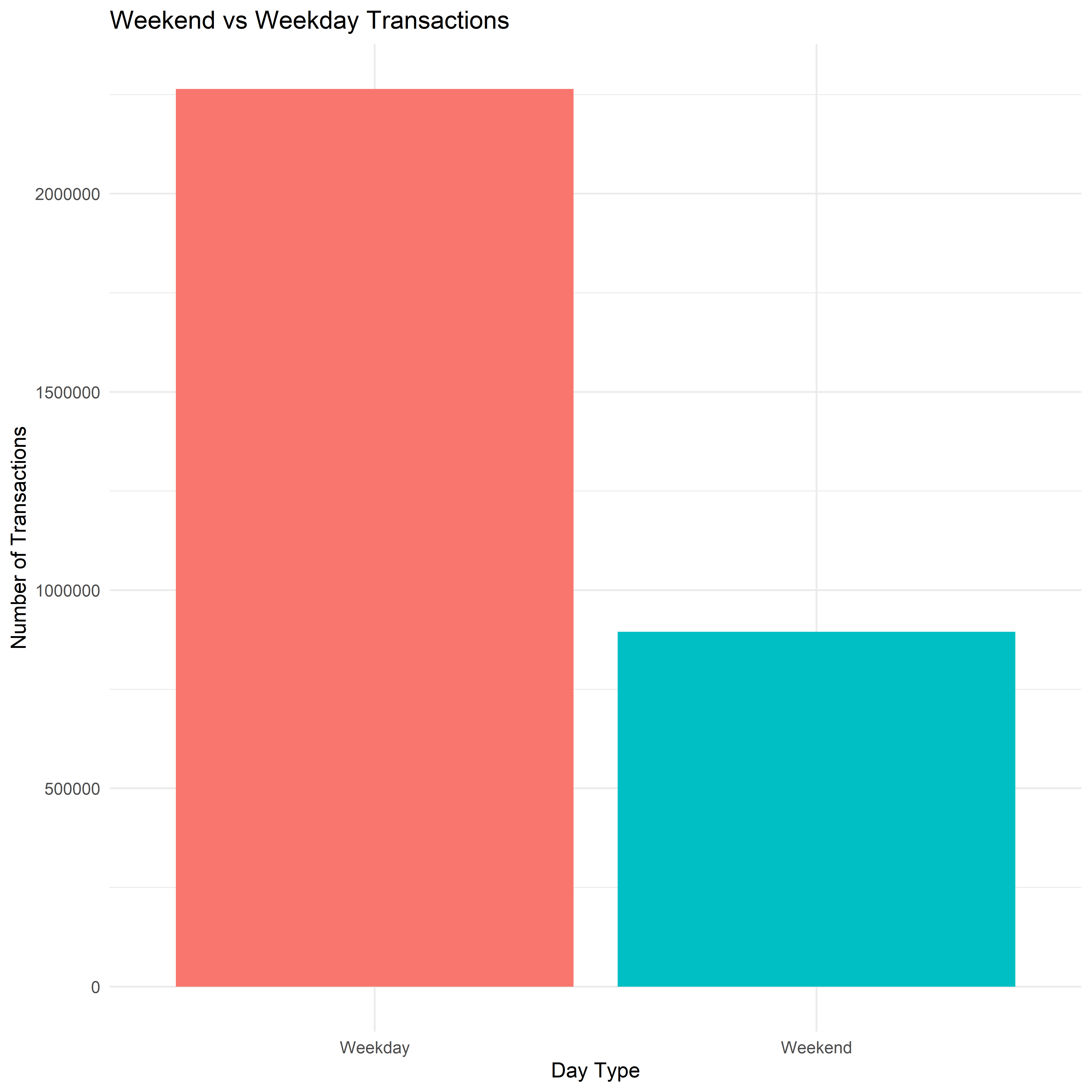
Note
Transactions on Weekends make up for about 30% of the transactions, suggest that the platform is being used more often on weekend by the customers, comparing to the amount of weekday activities.
6 Summary of Exploratory Data Analysis
From the univariate analysis, the majority of customers fall within the low to medium income bracket, indicating that the platform serves the broader population rather than exclusively high networth users, and most of them log into the application between 10 and 30 times per month, reflecting consistent interaction with the platform.
The distribution of customer lifetime value (CLV) is strongly right-skewed, meaning that the platform did not generate revenue from the low-to-middle majority of customers, and it is not the main focus of the platform.
Satisfaction scores are largely concentrated in the moderate to high satisfaction levels, suggesting generally positive user experiences. However, the Net Promoter Score (NPS) distribution remains mostly negative, indicating that although customers may be moderately satisfied, they are less likely to recommend the platform to others.
Relationship analyses highlight several important behavioral patterns. Higher app login frequency is associated with slightly lower churn probability, suggesting that increased engagement may contribute to improved customer retention. However, the relationship between app engagement and NPS appears relatively weak, indicating that higher usage does not necessarily translate into stronger customer advocacy.
Additionally, customers with higher satisfaction levels tend to exhibit higher transaction frequency, suggesting that positive experiences with the platform may encourage more frequent financial activity.
Finally, transaction-level analysis reveals that daily transaction volumes remain stable throughout the year, with only minor fluctuations observed across the time period. This indicates consistent usage of the fintech platform by its customer base.
Overall, the EDA highlights several key insights into customer behavior, engagement, and financial activity patterns. These findings provide a strong foundation for further analysis in subsequent modules, such as confirmation and predictive modeling, which aim to identify high-value customers and better understand the drivers of customer retention and platform engagement.
7. UI Design
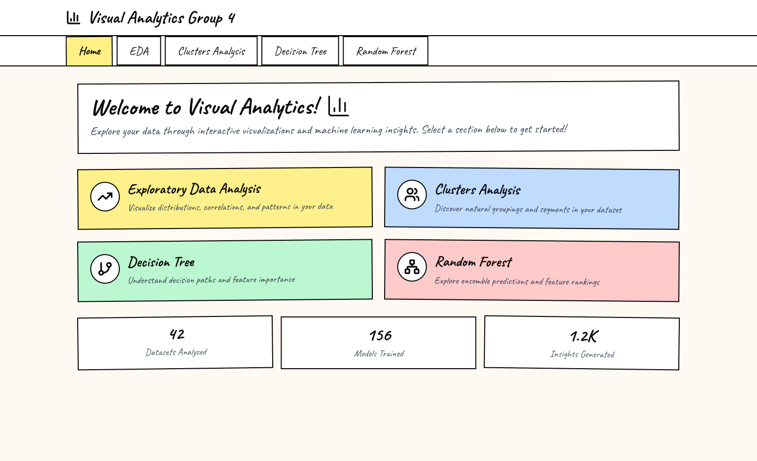
Our target is to provide a clean, intuitive, and structured interface that allows users to explore data insights in an organized way. The interface adopts a card-based layout, making different analytical modules easy to identify and navigate.
Navigation Structure
The application uses a top navigation bar that allows users to switch between the main analytical modules.
The currently active section is highlighted with a distinct color indicator, allowing users to easily identify their current location within the dashboard.
Home Page Interface
The Home page serves as the central overview of the analytics platform.
Welcome Banner: Introduces the dashboard purpose & provides brief instructions for users
Feature Cards: The dashboard presents main analytical modules using colored cards
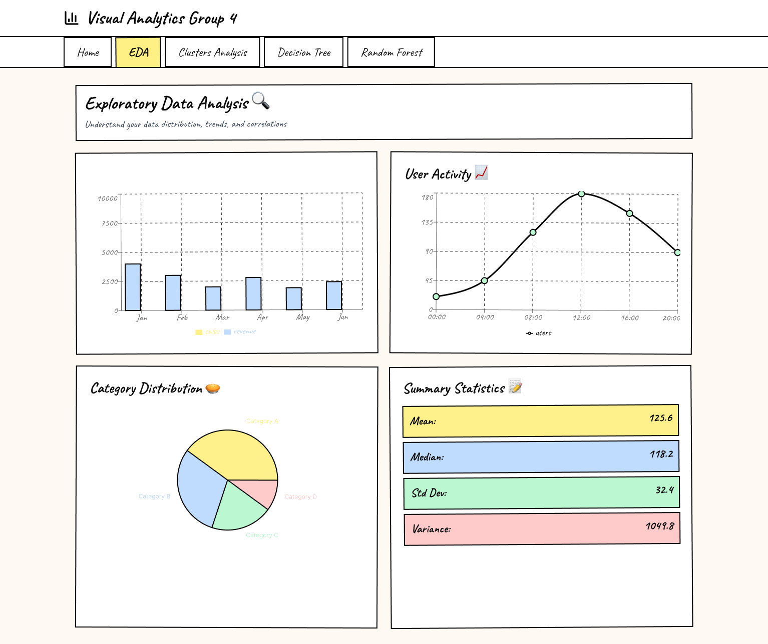
Exploratory Data Analysis (EDA) Page is designed to help users understand the dataset through multiple visual perspectives.
Layout Structure:The page adopts a two-by-two card layout, organizing visualizations into separate panels.